Tag: body composition

  • How to Build a Joined-Up Health Dashboard an AI Can Actually Coach You From

    How to Build a Joined-Up Health Dashboard an AI Can Actually Coach You From

    Nothing in this post is medical advice. I am not a doctor. Talk to your GP about anything health-related, especially blood pressure and medications. This guide is about organising data you are already collecting, not about diagnosing or treating anything.

    Last week I wrote about what happened when I let an AI read all my health data at once. It found two things that no single gadget on its own could have seen: that my blood pressure tracked a knee injury with almost frightening precision, and that my body had been quietly recomposing in the wrong direction while the scale weight stayed flat.

    Several people asked how I actually set up this AI health dashboard. This is that post.

    The short version: it is simpler than it sounds, it costs nothing beyond what you already own, and the hardest part is doing it the first time. After that it runs itself.

    Step one: map your AI health dashboard inputs

    Before you touch any technology, write down what you are already measuring. The system only works if you know what each device actually owns.

    Mine looks like this. The Garmin Fenix 8 owns heart rate, sleep, steps, VO2 max, Body Battery and HRV. The Hilo blood pressure monitor owns continuous daytime and night-time blood pressure. The Hume Health Pod owns weight and body composition. And Bluecrest Health Screening owns my clinical baseline: the ECG, the blood panel, the numbers a GP would care about.

    Yours will be different. The principle is the same. Map out what you have before you start trying to connect it.

    Step two: one source of truth per metric, no exceptions

    This is the rule that matters most, and it is the one most people skip.

    If two devices measure the same thing, pick one and ignore the other. The trap I learnt the hard way: my old Renpho scales and the Hume Pod gave me completely different body fat readings. Average them and you get garbage. Use both and you spend your time reconciling contradictions instead of acting on information.

    My hierarchy: Garmin owns activity and sleep, Hilo owns blood pressure, Hume owns body composition and weight. For anything clinical it is the Bluecrest results. No metric has two masters. If your phone health app also tracks steps, turn off the phone steps and let Garmin own it. If your Garmin tracks blood oxygen, fine, but Hilo owns blood pressure. The hierarchy is absolute.

    Tell Claude the hierarchy in your first session. Five minutes of clear instructions saves hours of confused analysis later.

    Step three: get the data out of the walled gardens

    Each device lives in its own app and does not naturally talk to the others. There are three routes out.

    Garmin. Go to Garmin Connect data management on a browser, find your account settings, and request a full data export. Garmin will email you a download link. It contains your full history as a series of files. Keep the activity summary files. They are what the AI health dashboard needs.

    Google Health Connect (Android). This is the cleanest route if you use Android. Go to Settings on your phone, find Health Connect, go to Manage Data, then Backup and Restore. Set a scheduled export to Google Drive. From that point your health data flows automatically into a folder without you doing anything. One caveat: the native export is a zip file aimed at restoring to a new phone, not at human reading. A simple CSV export app that reads Health Connect, and there are several free ones, gives cleaner files that Claude can actually parse easily. Worth the extra five minutes of setup.

    Apple Health. The same principle applies on iOS. Go to your profile in the Health app and export all health data. It goes to a zip file which you can then upload to Google Drive. Or use a third-party app that exports to CSV directly. Again, cleaner and more useful.

    Hume weekly reports. This is the lazy trick that works surprisingly well. When the Hume app generates your weekly health report, take a screenshot and drop the image in your Google Drive folder. Google automatically OCRs the image, meaning it reads the text and numbers from the picture, and Claude can then read those numbers directly from the screenshot without any additional work. No CSV, no export, no faff. Just a screenshot.

    Clinical results. If you have Bluecrest or any other health screening, keep the PDF in the same folder. Claude reads PDFs. Your GP letters, your blood panel results, your ECG report, all of it can go in and all of it is readable.

    AI health dashboard setup showing Garmin Hilo and Hume data connected via Google Drive to Claude

    Step four: wire it to Claude through Google Drive

    Create a folder in Google Drive. Call it something obvious like Health Data or 3am Health Dashboard. This is your single source of truth.

    In Claude, go to your connected tools and connect Google Drive if you have not already. Once it is connected, Claude can read any file in your Drive at the start of each session, no uploading, no re-attaching. You drop the Hume screenshot in the folder on Monday morning. On Tuesday when you open Claude and ask about your health data, it reads the screenshot directly from Drive and includes it in the analysis.

    This is what turns a monthly snapshot into a living system. The data is always current because you are dropping files into a folder rather than going through an upload ritual.

    Step five: give Claude the house rules

    The first time you use the system, spend five minutes telling Claude how it works. I give it these rules at the start of any health session:

    Source hierarchy: Garmin owns activity and sleep, Hilo owns blood pressure, Hume owns weight and body composition, Bluecrest owns clinical. If two sources conflict on the same metric, Bluecrest beats everyone, then Hilo beats Garmin for BP, then Hume beats any scales.

    Fill blanks only: if a metric is missing from one source but present in another, use the other. Never average across sources for the same metric.

    Lead vs lag: treat steps, hard effort minutes, sleep quality and HRV as leading indicators, the things I control today. Treat blood pressure, VO2 max, body fat and weight as lagging indicators, the results that follow 4 to 8 weeks later. When I ask what to do, focus on the leads. When I ask how I am doing, focus on the lags.

    That is it. Three rules. They stop the analysis from becoming confused and keep the output genuinely useful.

    Step six: run a weekly loop with a recovery gate

    Once a week, drop in the latest data and ask Claude for a short scorecard. I ask for three things: how the leading indicators look this week versus last, how the lagging indicators are trending over the past month, and one specific thing to change or focus on.

    One change. Not five. One.

    The recovery gate is the thing the Garmin Fenix 8 review touched on but this system makes into an actual rule: if HRV, sleep quality and Body Battery all decline for three consecutive days, that week is a recovery week. No hard efforts, no targets. I learnt this by ignoring it, pushing through what the data was clearly telling me was a system under stress and then being ill for a week. The data was right. I was wrong. Now I follow the gate.

    Step seven: know what this is and is not

    A few honest caveats before you get too excited about your new AI health system.

    It is n=1 data. Everything the AI tells you is about you, based on your data, with all the noise and error that comes with consumer devices. The correlations I found between my knee injury and my blood pressure are real and consistent, but they are not a controlled study. Association is not proof. The AI can spot patterns you cannot see by eye. It cannot tell you what caused what.

    It is not your doctor. The best use of this system is walking into a GP appointment with a six-month trend instead of a single anxious clinic reading. Showing a doctor that your blood pressure tracked the exact months you were inactive is a different conversation from showing them a single number taken while you were worried about being there. Use it to have better conversations with professionals, not to replace them.

    Mind the privacy trade-off. You are putting personal health data into a cloud folder. Use your own Google Drive under your own account. Know what you are sharing and with whom. For most people this is a reasonable trade for the insight it provides, but it is worth being conscious of it.

    What this actually looks like in practice

    My folder currently has: the Garmin CSV export from last month, this week’s Hume screenshot, the Hilo app screenshot showing my 13-month BP trend, and the Bluecrest PDF from May. That is four files. The whole setup took about an hour the first time. Now it takes five minutes a week to drop in the new Hume screenshot and a couple of minutes to run the weekly check with Claude.

    What I get back is a short paragraph on where the leading indicators are, a one-line summary of the trend on BP and body composition, and one thing to do differently this week. Last week it was push the Tuesday climbing session from one hour to ninety minutes. The week before it was take Wednesday off because three days of declining HRV said the system was tired.

    Small changes, directed by data. That is the whole system.

    The thing I wish I had done earlier

    I had all four of these devices for months before I connected them. Each one was useful on its own. Together they are a different thing entirely. Not just more data, but a coherent picture of a single body over time, with something intelligent reading the whole thing at once.

    If you have a Garmin and a smart scale and a blood pressure monitor, you already have everything you need. The missing piece was never more gadgets. It was a brain joining them up.

    Now you have one.

    One practical note: the Hilo data in this post is now feeding a live experiment. I’m running a pre-registered 30-day beetroot trial for blood pressure, using the dashboard described here as the measurement infrastructure. The full protocol is published here if you want to see how the system gets put to use in practice.


    About the author: I’m Pete Harrison. I’m 55, I run a business, and I have a mild case of insomnia that means I spend a lot of time at 3am reading about gadgets, gear and ways to make life work better. Things I Learnt at 3am is where I write honestly about the things I’ve actually bought, tested and lived with. No fluff, no rehashing the spec sheet. Just the real verdict from someone who uses this stuff every day.

  • My Blood Pressure Didn’t Rise Because I Got Older. It Rose the Day I Did My Knee.

    My Blood Pressure Didn’t Rise Because I Got Older. It Rose the Day I Did My Knee.

    Nothing in this post is medical advice. I am not a doctor. Talk to your GP about anything health-related, especially blood pressure and medications.

    I was awake at 3am again. Nothing unusual about that. But this particular session had a specific edge to it, the kind that comes when a question has been sitting unanswered for long enough that it starts to feel personal. My blood pressure was still elevated. I am on medication. I have been since 2005. And yet there it was, sitting stubbornly at 133/85, refusing to behave, and I was lying in the dark wondering the same thing I have wondered a hundred times: is this just what my fifties are?

    The answer turned out to be no. It is not my age. It is my knee. And I only found that out because I stopped looking at my health gadgets one at a time and let an AI read them all at once.

    The gadget problem

    I have more health data than most GPs see in a year. A Garmin Fenix 8 on my wrist tracking heart rate, sleep, VO2 max, Body Battery and HRV around the clock. A Hilo blood pressure monitor on my other wrist giving me continuous BP readings, day and night. A Hume Health Pod on the bathroom floor measuring body composition, lean mass, body fat and metabolic age every morning. A Bluecrest medical screening with a 6-lead ECG, blood panel, the lot.

    Garmin Connect screenshot showing VO2 max trend over time
    Garmin VO2 Max

    Four devices. Each brilliant at what it does. None of them talking to each other. Each one a different sense, with no brain joining them up into a single coherent picture.

    For a while I handled this the old way. I used to export everything once a month and hand it to Gemini as a sort of personal health assistant, upload the files, ask it to spot trends, read the output. Useful. But it was a snapshot of a moving thing. A monthly photograph when what I needed was a film.

    Wiring it in properly

    This time I did it differently. I set up a folder in Google Drive and connected Claude to it directly. The rule is simple: anything I drop in the folder, Claude reads live at the start of each session, no uploading, no monthly ritual. The Hume weekly report goes in as a screenshot and Google’s OCR picks up the numbers automatically. The Garmin data flows in too. For the first time, the whole picture sits in one place and updates itself.

    Hilo app screenshot showing blood pressure trending upward over recent months
    Not great seeing this trend

    Claude suited this better than Gemini for one specific reason: it integrates cleanly into the same ecosystem as my Garmin data through Google Drive, and I wanted something that could read across all the sources in a single session rather than requiring separate uploads to different tools. The result is less a monthly snapshot and more a living dashboard that I can interrogate in real time.

    And the first thing it did was find two things that no single gadget on its own could have seen.

    The blood pressure detective story

    I gave Claude 13 months of data. Blood pressure from the Hilo, steps and fitness from the Garmin, body composition from the Hume, and the Bluecrest clinical numbers as a baseline. I asked it to look for patterns I had missed.

    Hilo blood pressure app screenshot showing a recent seven day average reading

    It found one immediately. My blood pressure did not drift upward gradually, the way you might expect from age or stress or the general accumulation of life. It moved on a date. And when Claude lined up the BP trend against everything else, the picture was almost uncomfortably clear.

    August 2025 was my best month. Daytime blood pressure averaging 121/77. I was doing around 13,700 steps a day. Nearly 1,000 minutes of hard effort exercise a week. VO2 max at 44. Weight around 87kg. Everything pointing in the right direction.

    Then in October and November I did my knee.

    Steps roughly halved. Hard effort minutes roughly halved. Weight climbed about 10kg over the following months. VO2 max fell five points. And blood pressure marched up to 137/87 by December and parked there.

    The correlations Claude pulled were almost comically tidy. Weight against BP: 0.84. Steps against BP: minus 0.85. Hard effort minutes against BP: minus 0.83. VO2 max against BP: minus 0.79. Every metric pulling in lockstep, all of it pointing back to a single event. It was not five problems. It was one event with five shadows.

    Twenty years of wondering whether it was salt or stress or just bad luck. And the answer was sitting in the data the whole time, waiting for something to read the whole book at once.

    The scale that was lying by omission

    The second finding was quieter but stopped me just as sharply.

    Between January and June 2026 my weight on the Hume scales went from 96.2kg to 97.3kg. Barely a kilo. If I had been using a bathroom scale, I would have shrugged and moved on. Not much happening, you would think.

    Hume Health Pod app screenshot showing body fat rising and lean mass falling over five months

    But underneath that flat number, my body had been quietly recomposing in the wrong direction. Body fat up 3.3kg, from 18.3 to 21.6kg. Body fat percentage from 19 to 22.2. Lean mass down 0.9kg. Metabolic age drifting from 41 to 44. Health score from 697 to 662.

    The scale weight was almost completely flat while the makeup of me was getting measurably worse. A standard bathroom scale would have told me nothing was happening. The Hume Pod already hinted at this in the review I wrote about it, the lean slightly low, the fat slightly above expected for my frame. But this was the moving picture version. Five months of quiet drift, invisible to a single number.

    This is exactly why I wrote what I did in the Hume Health Pod review about ditching the Renpho. The cheap scale was not just inaccurate. It was lying by omission, because it only had one thing to tell me.

    The reassuring part

    I want to be honest about both sides of this, because the picture is not all bad and I do not want to write something that just sounds like doom.

    The dangerous fat, the visceral kind that sits around your organs and drives cardiovascular risk, stayed low throughout. Index 8 to 9 the whole time. The gain was subcutaneous, the kind you can see, not the kind that quietly kills you. The Bluecrest ECG was clean. Sinus rhythm, 66 bpm, no ectopics. Blood sugar normal. HDL cholesterol at 1.8, which is elite. 59 green flags on the screening.

    And the engine responds. Between 2017 and 2025 my resting heart rate fell from 71 bpm to 53 bpm as my training roughly tripled. The body knows what to do when you push it. What is happening in 2026 is that process running in reverse because I stopped pushing.

    The plan, and why it is simpler than I expected

    The good news about having one cause is that it points to one fix. Rebuild the aerobic base using what the knee will allow: the bike, incline walks, the rebounder, climbing. Get back toward summer 2025 activity levels. Push sleep from around six hours toward seven or more, because the Fenix data has repeatedly shown me what the Garmin Fenix 8 review touched on, that low HRV and poor sleep are the first signs of a system under stress, and the last things to recover.

    Everything else, the blood pressure, the fitness, the body composition, is downstream of those two things. That is what the data says. That is what I am doing about it.

    The green shoot

    The morning I finished pulling this together, my VO2 max ticked from 39 to 40 for the first time in months. One point. It means nothing on its own. It means everything as a direction.

    Update, July 2026: that green shoot turned into something. I have written up the first real evidence the recovery is actually underway, a fortnight of heat acclimation running that reclaimed ninety seconds a kilometre and a resting blood pressure finally easing off its six-month plateau, in my July interim report.

    What I actually learnt at 3am

    Your body keeps an honest ledger. The gadgets are not the point. They are pages. What changed is that something finally read the whole book at once, and the story it told was not that I am getting old. It was that I stopped moving, and here is exactly what it cost, now go and get it back.

    The next post covers the practical side: how I set this up, how you can do the same thing with whatever devices you already have, and what to tell the AI so it actually gives you useful output rather than just repeating your numbers back at you.


    About the author: I’m Pete Harrison. I’m 55, I run a business, and I have a mild case of insomnia that means I spend a lot of time at 3am reading about gadgets, gear and ways to make life work better. Things I Learnt at 3am is where I write honestly about the things I’ve actually bought, tested and lived with. No fluff, no rehashing the spec sheet. Just the real verdict from someone who uses this stuff every day.

  • Hume Health Pod Review: Is This the Smart Scale That Actually Tells You the Truth?

    Hume Health Pod Review: Is This the Smart Scale That Actually Tells You the Truth?

    This post contains affiliate links. If you buy through them I may earn a small commission, at no extra cost to you.

    I was awake at 3am looking at body composition scales because I had just stepped off my old Renpho and watched the body fat reading drop in perfect proportion to my weight. I knew immediately it was useless. It was telling me nothing. All it was doing was applying a formula to my weight and calling it data. I wanted actual data.

    This is my Hume Health Pod review, written after long-term daily use. The short version: it is the first scale I have owned that I actually trust.

    Why I ditched the cheap smart scale

    The Renpho was about £30 on Amazon. It looked impressive in the app. It showed me body fat, muscle mass, bone density, all the numbers. The problem was that every single metric moved in direct proportion to my weight. Lose a kilo, every number improved. Put it back on, every number worsened. That is not body composition analysis. That is just weight with extra steps.

    I started reading about what actually separates a decent body composition scale from a cheap one. The answer, consistently, was how many electrodes it uses and how many frequencies it scans at. Most budget scales use two electrodes, foot to foot, measuring only through your lower body and estimating the rest. More expensive clinical equipment scans at multiple frequencies across multiple pathways simultaneously. The Hume Health Pod does the latter.

    How the Hume Health Pod actually works

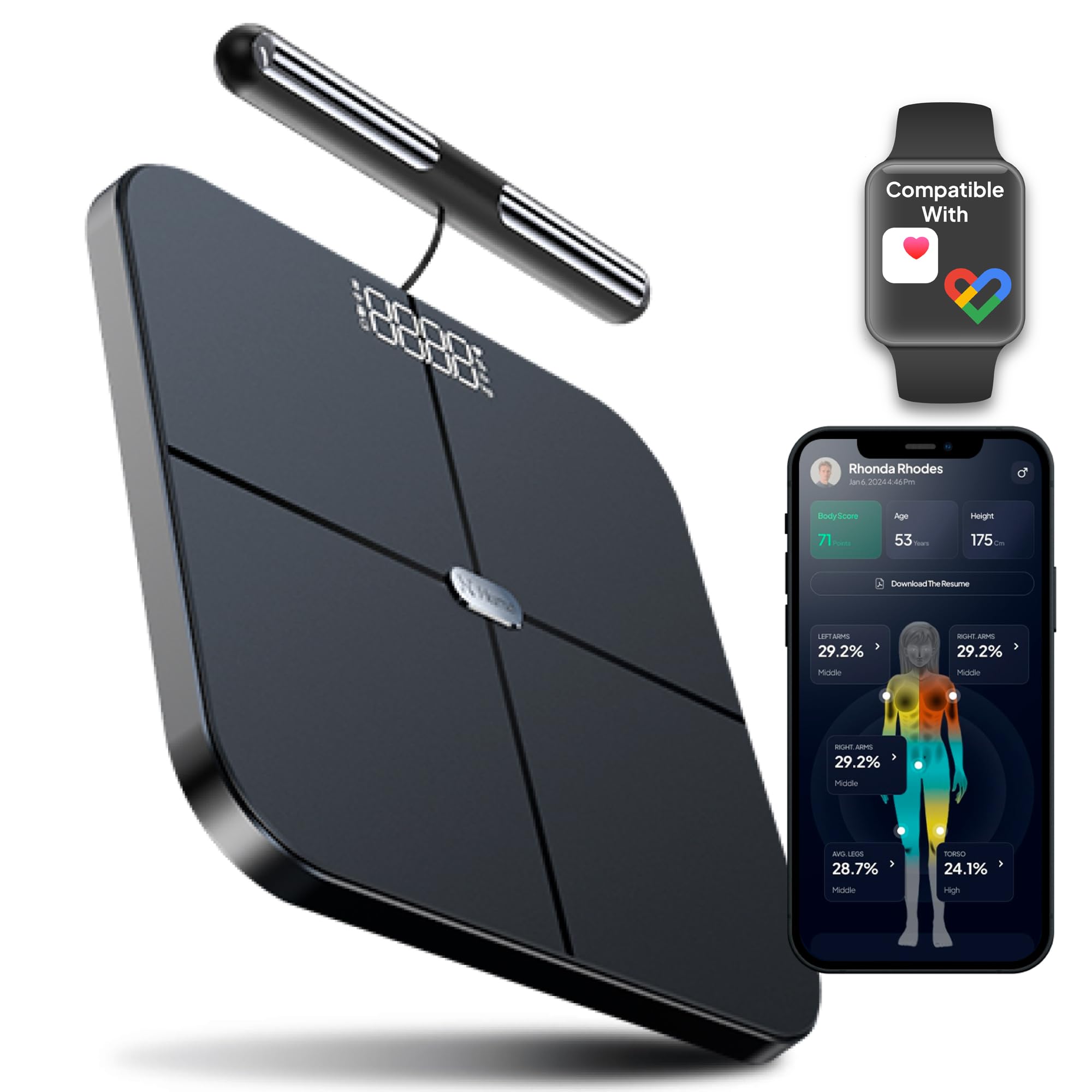
    You stand on the platform and hold a bar. That bar matters. Most scales only measure from foot to foot, which means they are only looking at your lower body and extrapolating everything else. The Hume Pod uses eight electrodes, four in the platform and four in the handle, scanning across your arms, torso and legs separately. It runs at multiple frequencies from 20kHz to 100kHz, which allows it to distinguish between fluid inside and outside your cells, giving a much more accurate picture of fat versus muscle versus water.

    The result is segmental analysis. Not just a single body fat percentage, but a breakdown by body part. This matters because you might have good overall numbers but be carrying fat in one area or lacking muscle in another. My data shows that clearly. My lean mass is slightly below expected for my height and weight, while my body fat is slightly above. Knowing that is actionable. A number on a bathroom scale is not.

    The accuracy question, and what Bluecrest confirmed

    I had a medical health check with Bluecrest Health Screening. One of the things they measured was body composition. When I compared their results to the Hume Health Pod readings from around the same period, they were remarkably close. That was the moment I stopped treating the scale as approximate and started treating it as a genuine data source.

    Hume claim 98% accuracy and have had the device independently validated by Socotech against DEXA scan results, DEXA being the gold standard clinical measurement used in hospitals. That validation is what sets it apart from the dozens of scales that simply claim accuracy without any third-party testing behind it.

    My Hume Health Pod stats, and what they actually mean

    Hume Health Pod app screenshot showing a health score of 662, biological age 47 and weight 95.9kg

    Here is where I am right now. I am 55. My health score is 662, rated High. My biological age comes out at 47, eight years younger than I actually am. My metabolic age is 42 to 44 depending on the reading, which is rated Excellent, 11 to 13 years below my chronological age. I weigh 95.9kg.

    Body composition: lean mass 71kg, body fat mass 21kg, body fat percentage 22.1%, skeletal muscle mass 48kg, average water level 58%. Lean mass is Standard but 2kg below expected. Body fat is Standard but 7kg above expected for my frame.

    Hume Health Pod app screenshot showing body composition breakdown including lean mass, body fat percentage and skeletal muscle mass

    What does that mean for someone trying to stay fit at 55? My aerobic fitness and metabolic health are in good shape. The Garmin Fenix 8 data backs this up with VO2 max and Body Battery metrics that have been consistently strong. But I am carrying more fat than I should be for my frame, and my lean mass is slightly lower than ideal. The practical implication is straightforward: prioritise protein and resistance work to protect and build muscle mass, while the fat comes down through activity and diet. I recently ran all of this data through Claude, the Hume numbers alongside the Hilo and Garmin, and what it found was revealing. The full story is in this post about what happens when you read all your health gadgets at once.

    It also connects via Google Health Connect to import your Garmin data, so the Garmin Fenix 8 and the Hume Pod give you a joined-up picture of fitness and body composition in one place. Same works for Apple Health if you are in that ecosystem.

    The app and what it is still developing

    Hume Health Pod app screenshot showing the weekly health report and trend data over time

    The Hume app is good and clearly being actively improved. There are sections, Activity and Sleep, currently showing a message saying they are being refined and will return shortly. That tells you the company is still building, and they would rather take something offline than leave it half-finished. I find that reassuring. The body composition data has always been there and has always been accurate. Everything else is a bonus.

    The app remembers up to 30 users, making it genuinely family-friendly. Weekly health reports are well-designed and show the trend data over time. That longitudinal view is where the real value is. Not any single reading, but the direction of travel over weeks and months.

    What about the Hume Band?

    Hume also sell a wearable band that adds cardiovascular score, sleep architecture and recovery data. I have not bought it. I already have the Fenix 8 doing all of that, and I do not need to duplicate it. If you do not have a capable wearable, the band would round out the picture considerably. For me, the Pod alone is the right call.

    Pricing: they never charge full price

    They never charge full price. That is not cynicism. It is just how they operate. There is almost always a promotion running or a discount code available. If you see it at full price, wait a week. Or use my link which gets you money off straight away: humehealth.com/PETER22195. I would not pay full price and you do not need to.

    Hume Health Pod review verdict: would I buy it again?

    Yes, without hesitation. It is the first scale I have owned where I trust the data enough to make decisions based on it. The Bluecrest comparison confirmed it. The app is improving constantly. And the integration with Garmin via Google Health Connect means it sits neatly inside the same health picture I am already building with the Hilo blood pressure monitor and the Fenix 8.

    If you are over 50 and thinking seriously about your health, and by that I mean not just your weight but your actual body composition, your muscle mass and your fat distribution, then a decent scale is not a luxury. It is the starting point. The Hume Health Pod is the one I would recommend. Just make sure you get it with a discount. Use this link and you will.


    A digital smart scale with a sleek black design, displaying numbers on a screen, next to a smartphone showing health data and compatibility with smartwatch applications.

    About the author: I’m Pete Harrison. I’m 55, I run a business, and I have a mild case of insomnia that means I spend a lot of time at 3am reading about gadgets, gear and ways to make life work better. Things I Learnt at 3am is where I write honestly about the things I’ve actually bought, tested and lived with. No fluff, no rehashing the spec sheet. Just the real verdict from someone who uses this stuff every day.